Smachna Molochka, rebranding a family-run cheesemaker
ABOUT THE PROJECT
Smachna Molochka is a small family-run cheesemaker with several points of sale. Before the project, it used different logo versions and unrelated designs for packaging, social media and print.
CHALLENGE
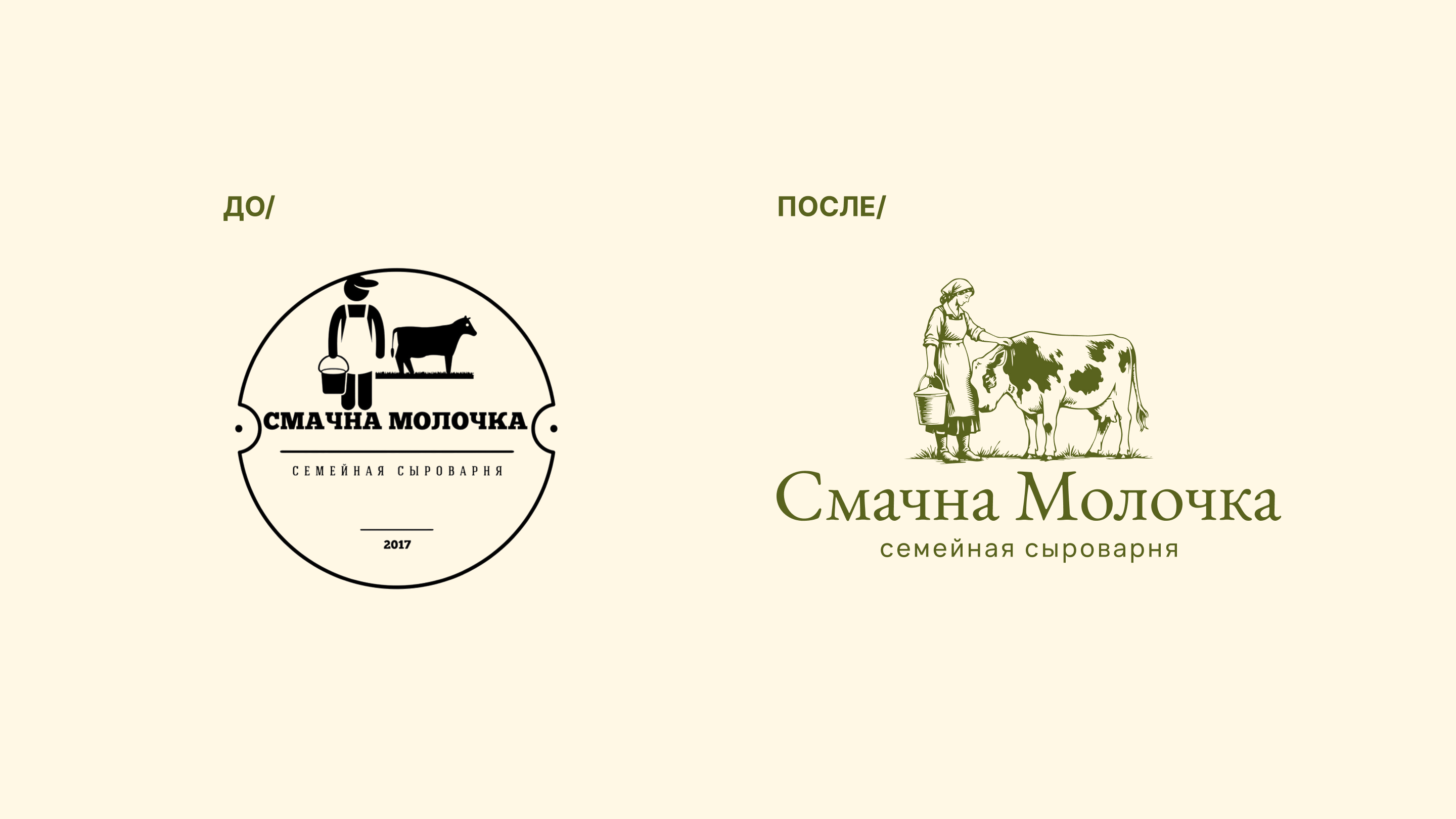
The brand lacked a cohesive visual identity and a clear distinction from a larger local competitor. Inconsistent logos and designs across formats weakened recognition and made it harder to build a lasting brand image.
SOLUTION
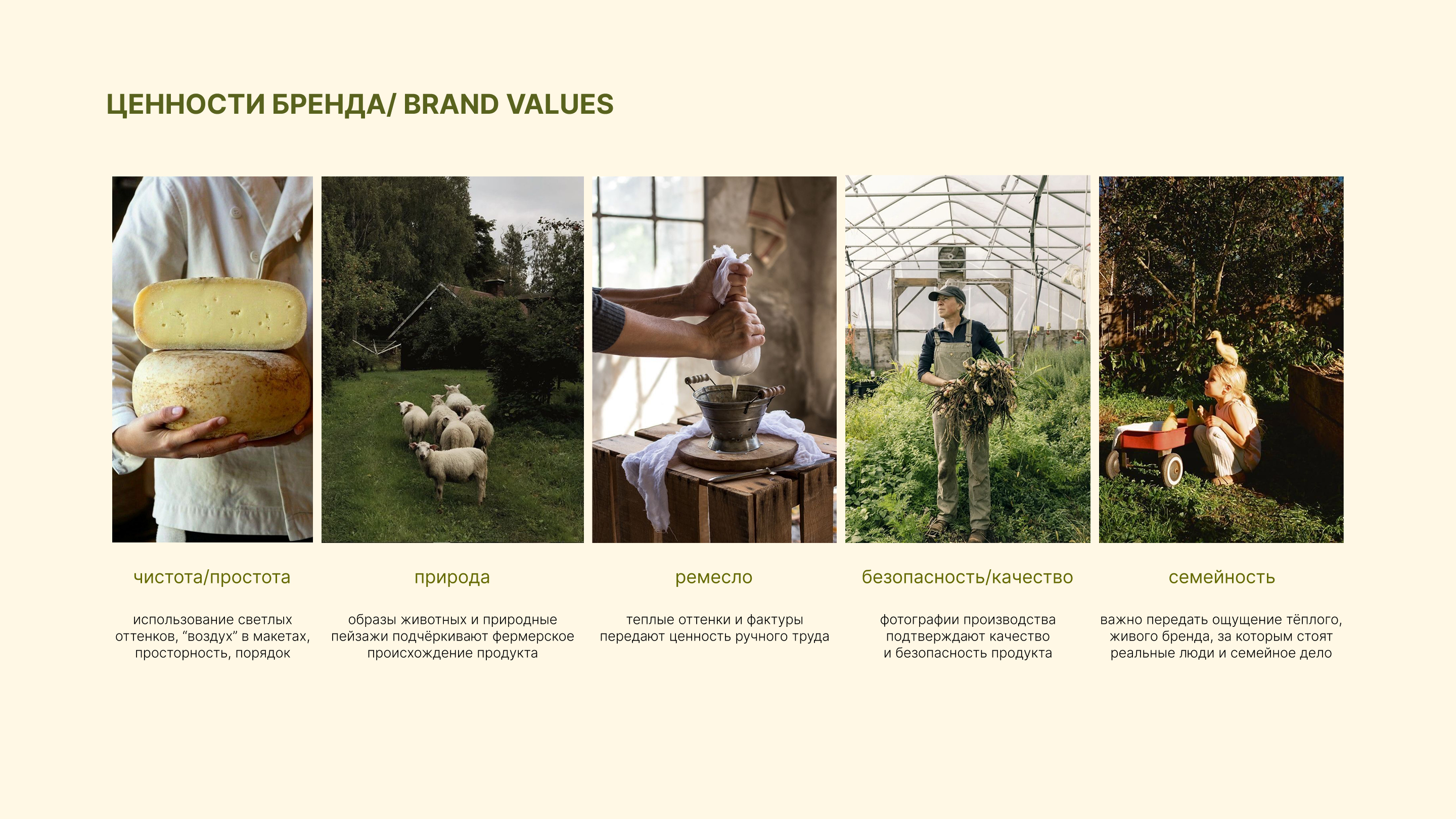
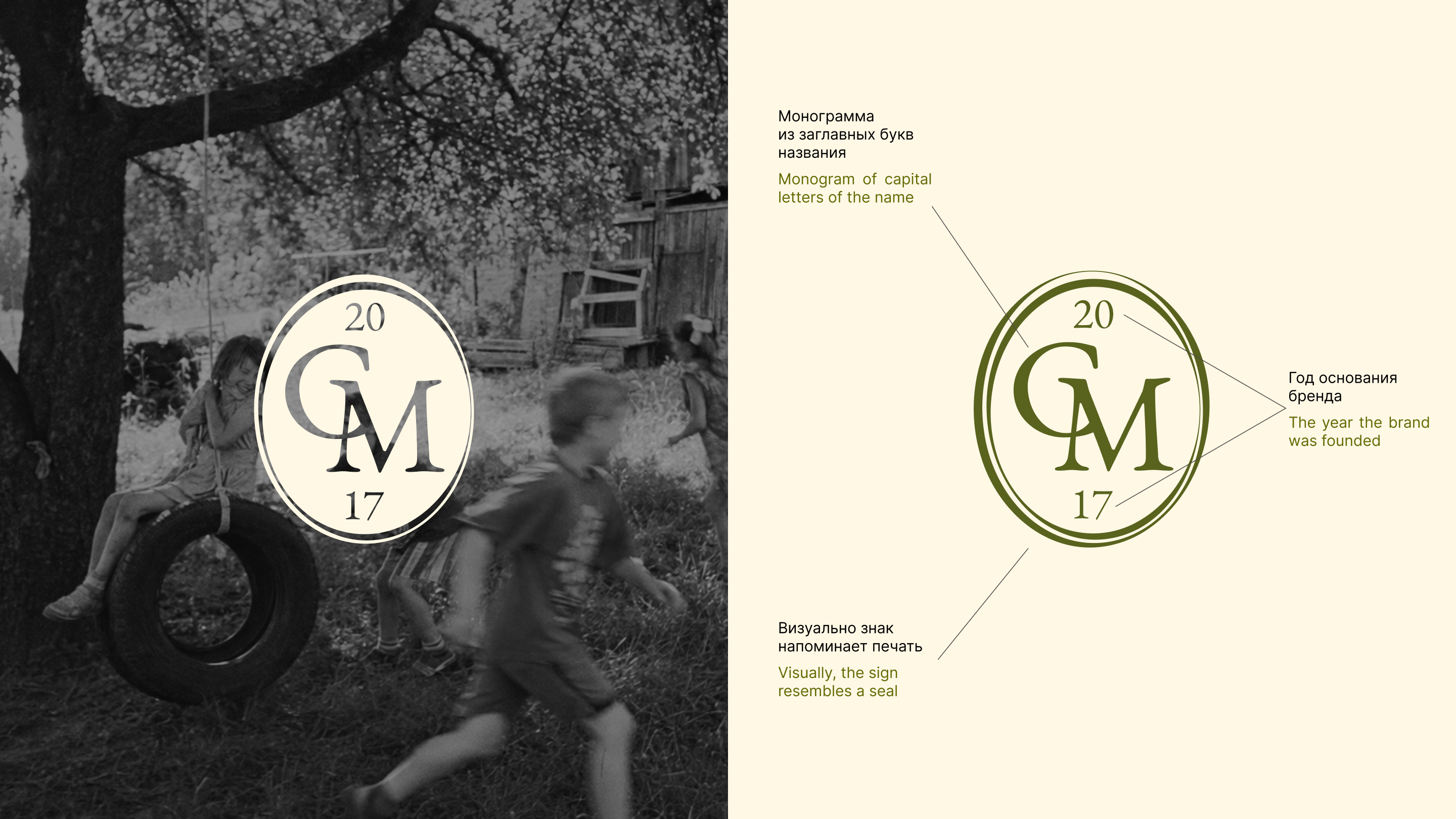
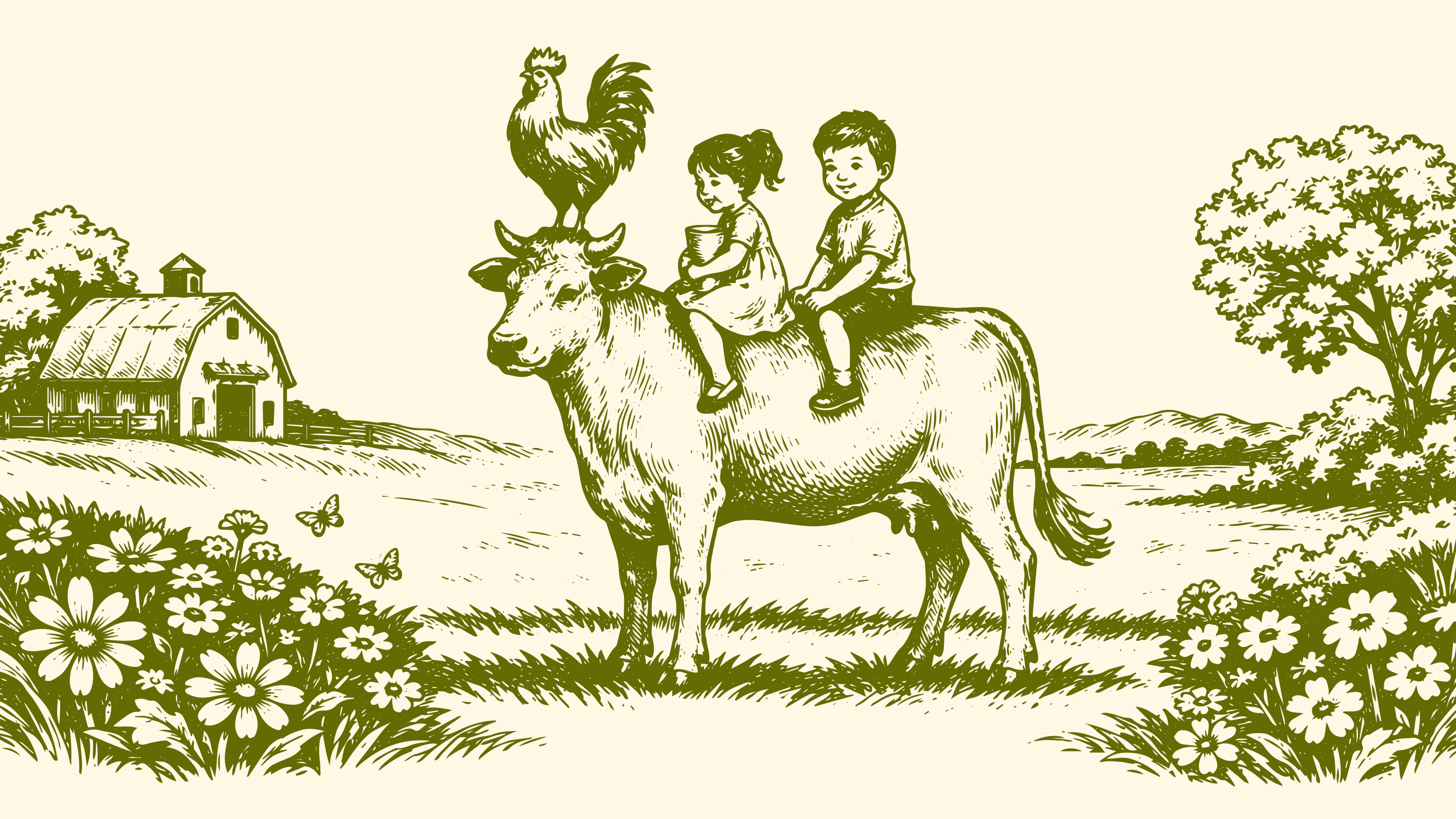
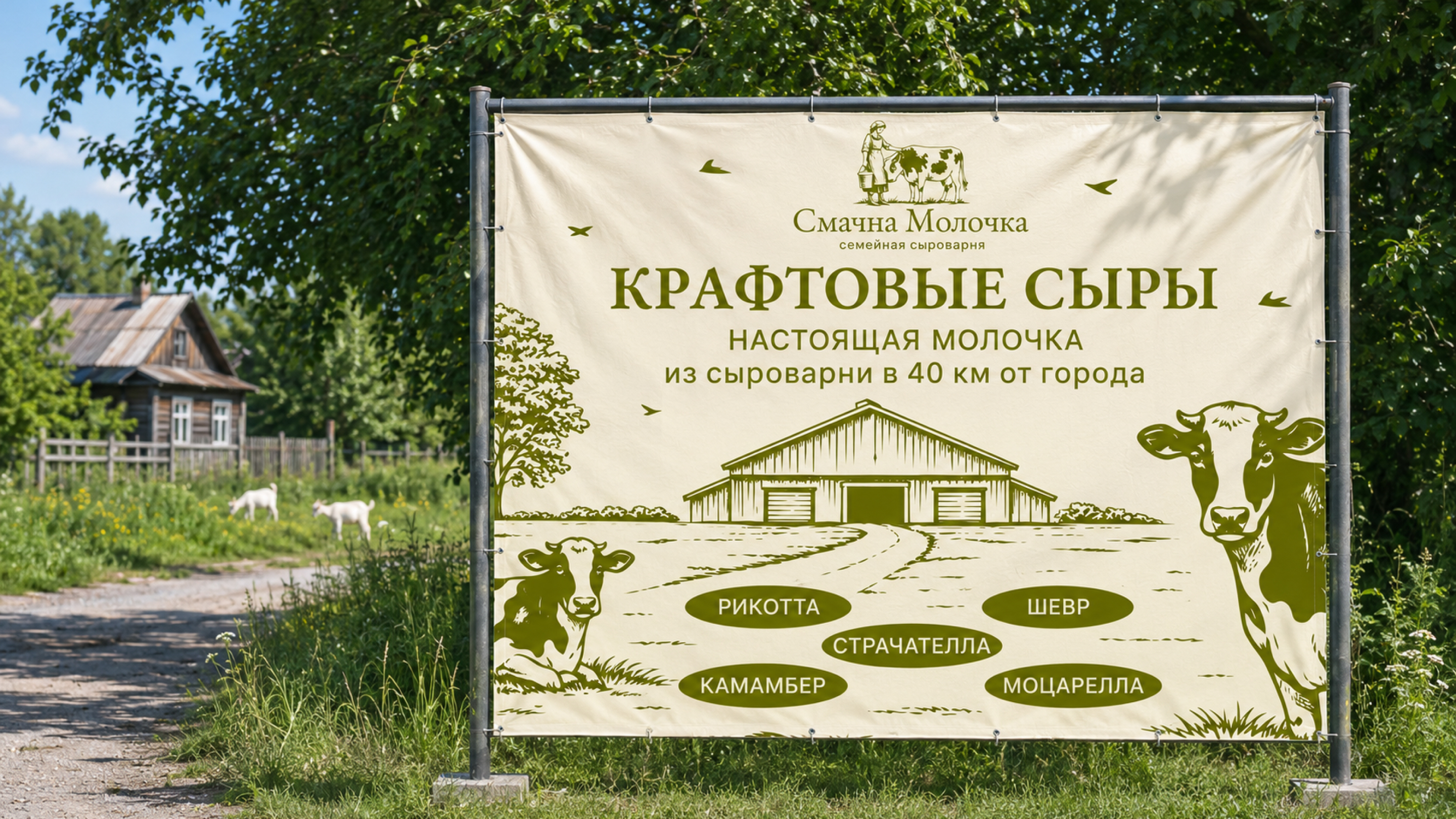
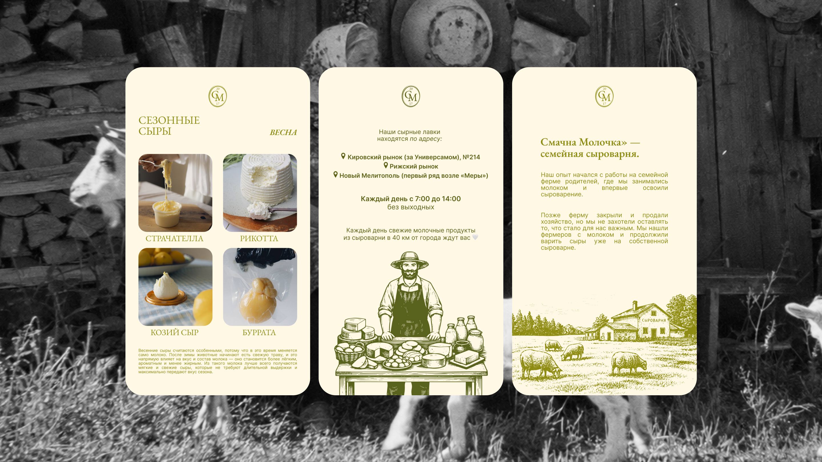
‘From hand to hand’ puts the family business at the centre. I proposed emphasising its local roots, craft approach and the personal involvement of the people who make the products. Engraving-style graphics, classical serif typography, a natural palette and a monogram seal support that idea.
IMPLEMENTATION
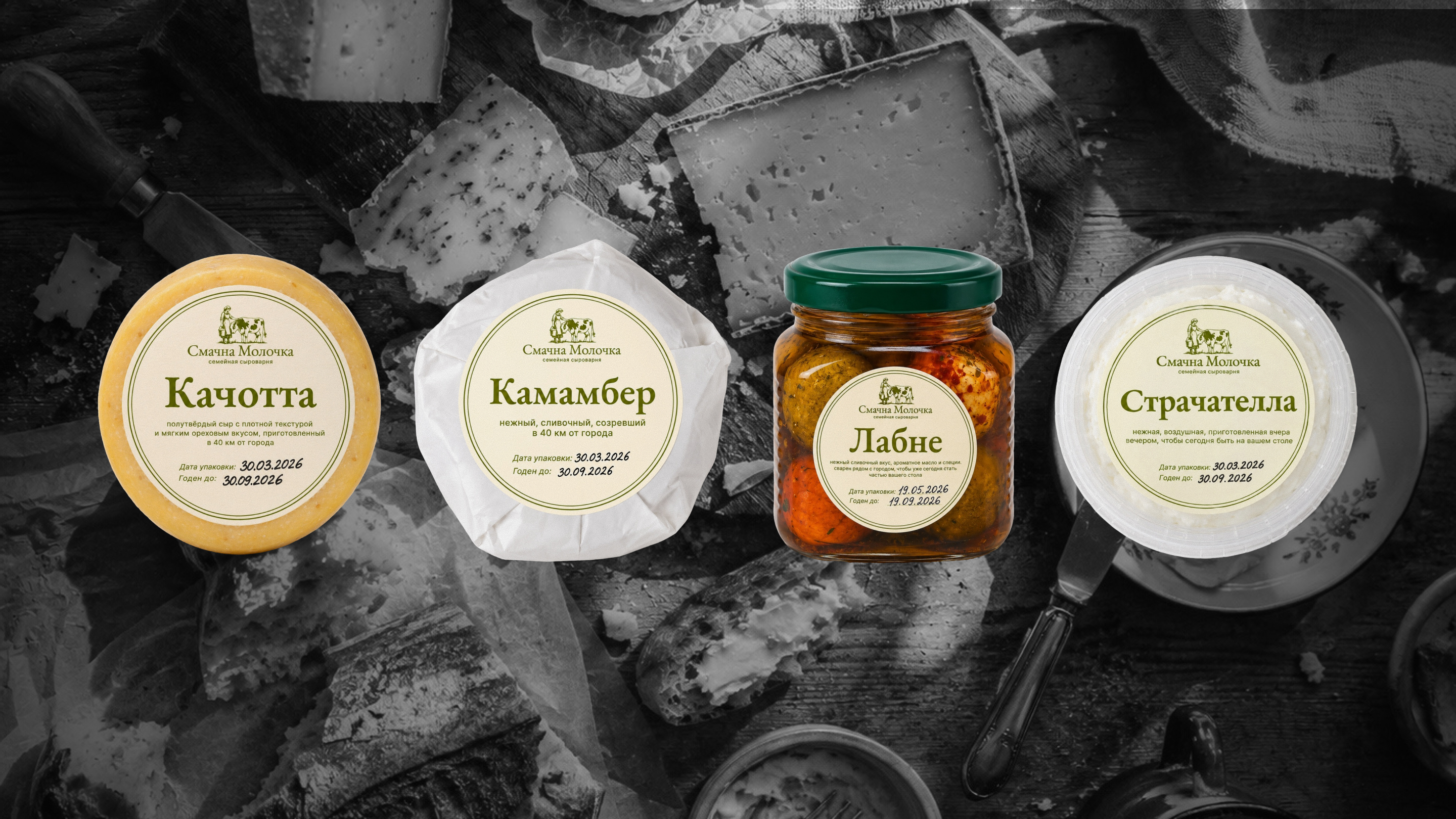
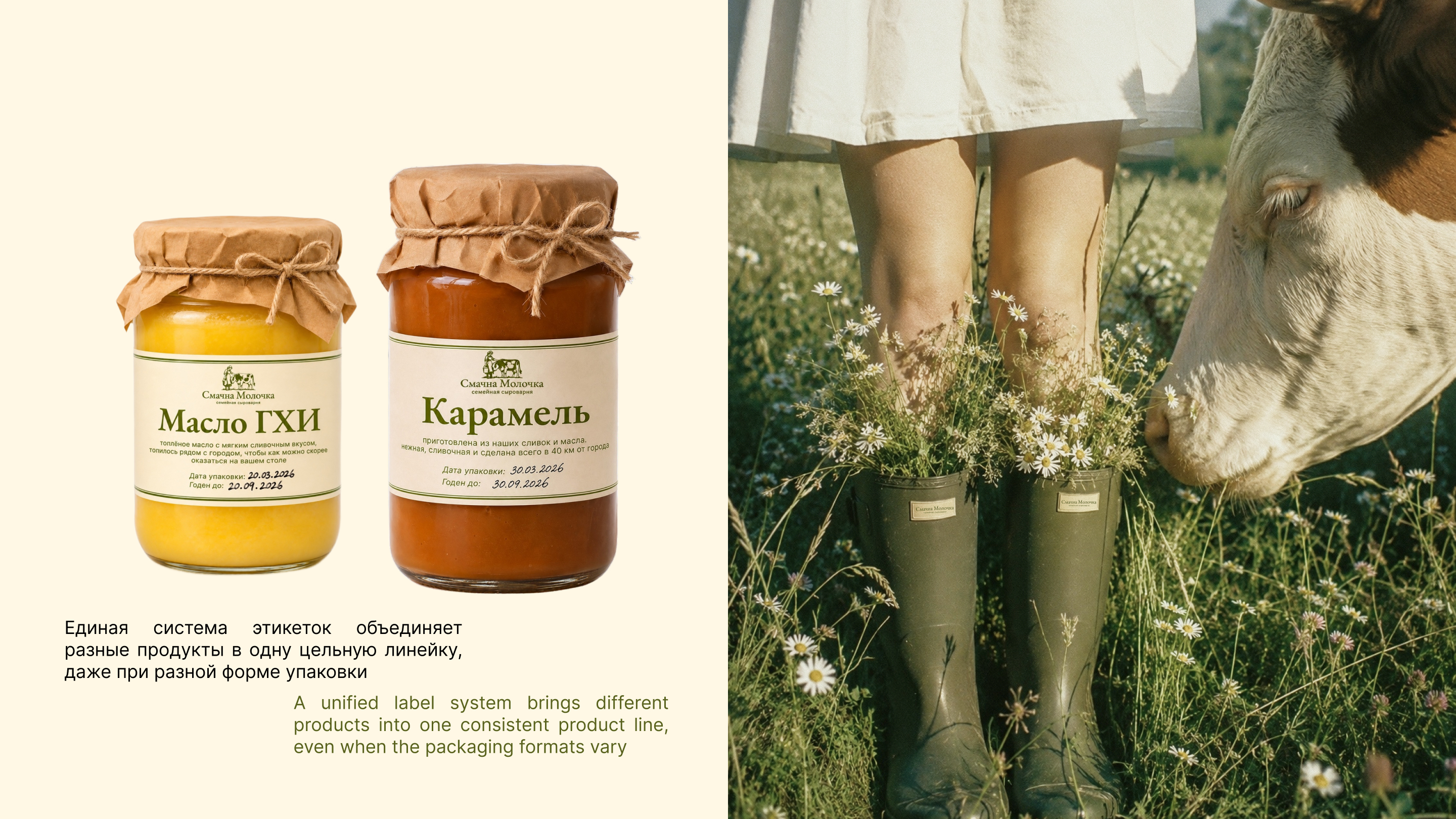
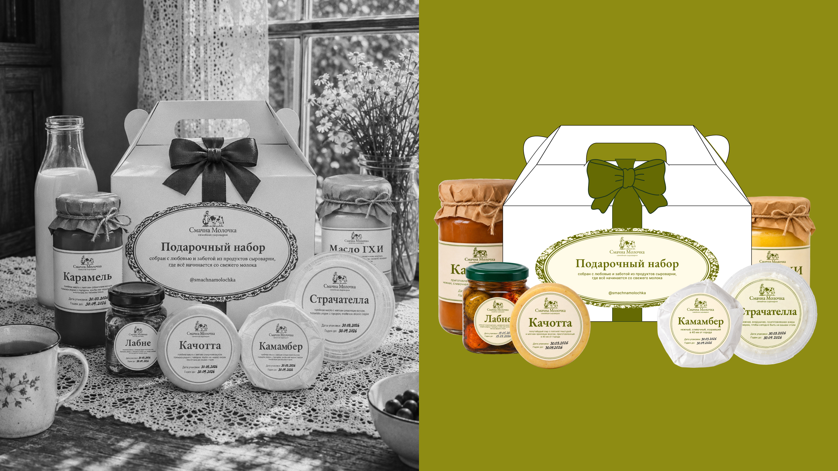
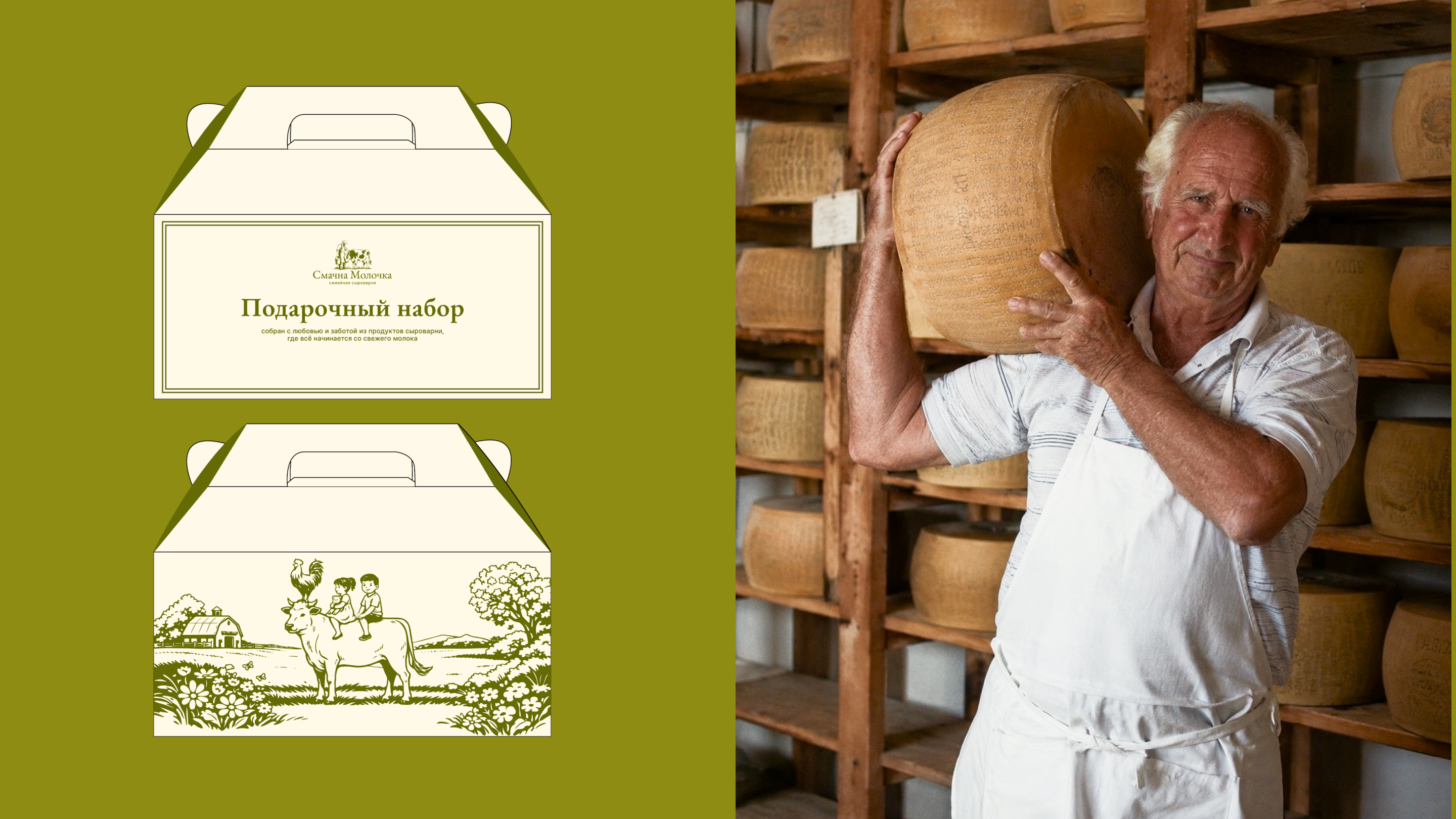
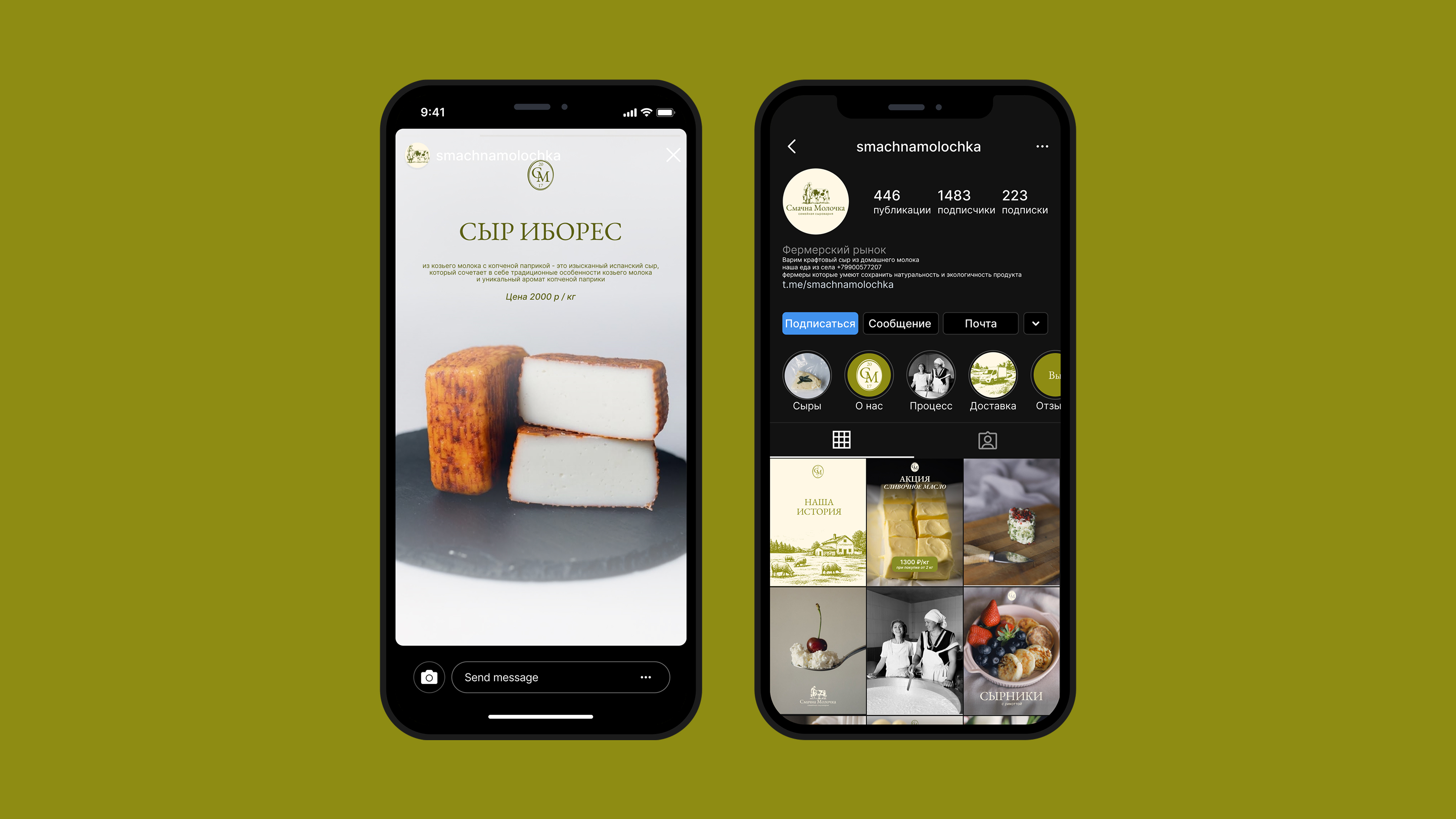
I updated the logo and developed secondary marks, illustrations, a pattern, a label system for different products, gift packaging and advertising materials. I prepared the artwork for print production.
RESULT
In the first two months after launch, sales grew by 20% and prices rose by 10% without a noticeable decrease in sales volume. Ad CTR was 2.1%, and social media engagement grew from 2% to 4%. The brand added one more point of sale.